
Space Settings
Space Settings is where a space administrator turns classification on for a space, chooses the classification levels people can apply, and sets the banner size. You reach it from your space’s Classification settings page, or through the byline onboarding flow.
The page has three sections, top to bottom.
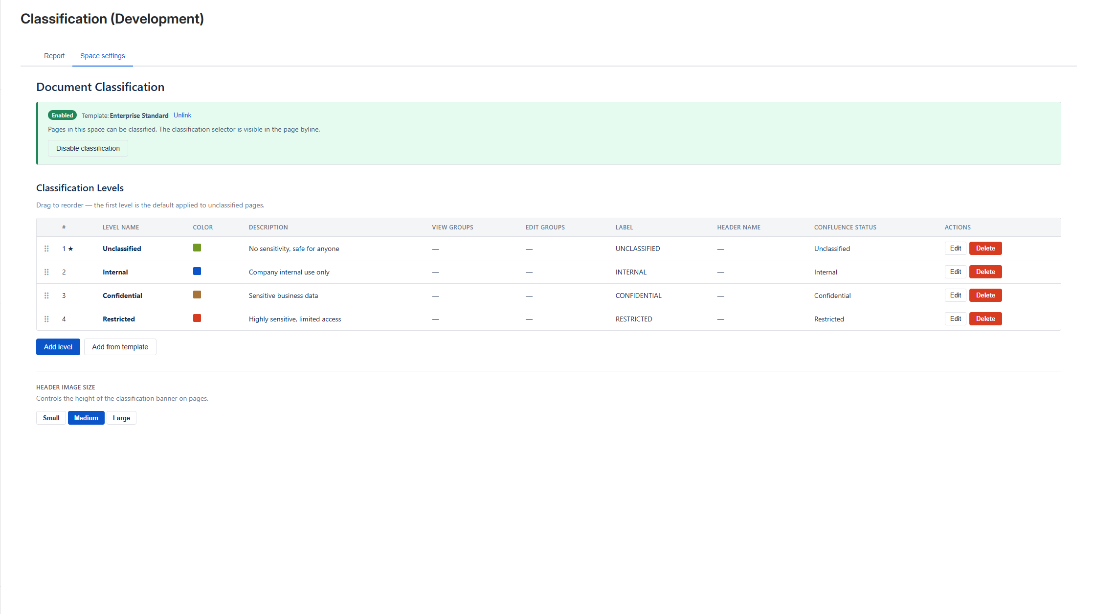
Status
Section titled “Status”A card showing whether classification is Enabled or Disabled for the space.
- When disabled, the only action is the primary Enable classification button. Until you enable it, page editors cannot classify pages.
- When enabled, the levels and other controls appear below.
- When your levels came from a global template, the card also names that template and warns that your levels are template-managed (see below).
Classification levels
Section titled “Classification levels”This is the heart of the space configuration: the list of classification levels page editors can pick from.
Where classification levels come from
Section titled “Where classification levels come from”You have two ways to populate levels:
- Apply a global template (recommended) — use Add from template to copy a ready-made set of levels published by your Confluence admin. This keeps your space consistent with the rest of the organisation. Once applied, the levels are copied into your space.
- Build your own — use Add level to create levels from scratch.
The status card names the template your levels came from, so you always know the source.
What is in a classification level
Section titled “What is in a classification level”Each classification level has:
| Field | Purpose |
|---|---|
| Name | For example Public, Internal, Confidential. Shown in the byline and banner. |
| Colour | The colour dot in the byline and the colour-band banner. |
| Description | Short explanation; shown on hover and on image banners. |
| View restriction groups | Confluence groups allowed to view pages at this level. |
| Edit restriction groups | Confluence groups allowed to edit pages at this level. |
| Label | The Confluence label added to classified pages (for example INTERNAL). |
| Page header style | image, colour, or none — see Page Banner. |
| Header image | The banner background, when the style is image. |
| Banner text size | How large the level name and description appear on the banner — see Banner text size. |
Reordering levels
Section titled “Reordering levels”Once you have levels, you can drag and drop to reorder them. The order is the order page editors see in the picker.
Header image editor
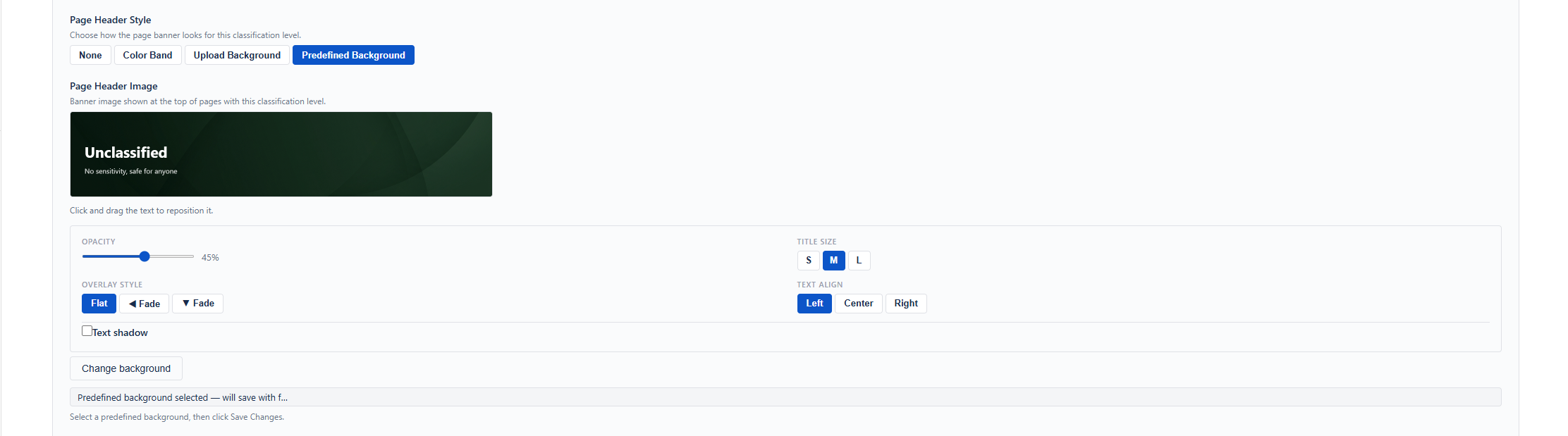
Section titled “Header image editor”When a level’s page header style is Image, you get a header image editor:
- Select background — choose from the built-in predefined header themes (no upload needed).
- Upload background — upload your own image; the level name and description are drawn on top and can be repositioned by dragging on the canvas.
- Remove — appears only for uploaded or previously saved custom images; clears the image.
Images are saved automatically when you save the level — there is no separate “save image” button.
The level name and description are not part of the saved image. They are drawn over it when the page is displayed. This is what allows them to resize to fit the banner, and it means you can change the wording later without touching the background.
Banner text size
Section titled “Banner text size”Each classification level sets its own text size for the banner:
| Setting | Range | Default |
|---|---|---|
| Level name | 16–72 | 42 |
| Description | 10–32 | 20 |
These are authoring sizes rather than final pixel sizes. What page readers actually see also depends on the space’s header image size: a Small banner has very little room, so large values are scaled back down to fit.
The editor shows the size each choice will really produce at your current header image size, and tells you when the banner is too short for the difference to show — in that case, switch the space to Auto.
These controls sit in the level form, so they apply to Colour page header styles as well as Image ones.
[Screenshot needed: the Banner text size controls in the level form, showing the rendered size hint beneath a slider]
Manage global templates
Section titled “Manage global templates”If you are also a Confluence admin, a “Manage global templates ↗” link appears in the levels section header, taking you to the global template library. It is hidden for non-admins and while you are editing a level.
Header image size
Section titled “Header image size”A secondary setting at the bottom controls the banner height for the whole space. It applies to every image and colour banner in the space.
| Size | Height |
|---|---|
| Small | 80px |
| Medium (the default) | 160px |
| Large | 240px |
| Auto | Grows to fit the description, between 80px and 320px |
Auto is the option to choose when your level descriptions run long. The fixed sizes shrink the text until it fits the banner; Auto keeps the text at its configured size and grows the banner instead.
The trade-off is that a text position you dragged in the header image editor is not applied in Auto mode — the level name and description use a standard stacked layout. See Page Banner for the full comparison.
Unlinking from a global template
Section titled “Unlinking from a global template”If your levels came from a global template and you want to start fresh:
- Use the Unlink action.
- Confirm in the warning dialog.
- The space resets to disabled with no levels, and is removed from the template’s linked-spaces list.
After unlinking you can re-apply a different global template or build levels manually.
Blocked spaces
Section titled “Blocked spaces”If your Confluence admin has blocked this space via Space Access Control, the whole settings page is replaced with an informational message and all controls are hidden — you cannot enable classification here. See Space Access Control.
Related
Section titled “Related”- Global Templates — where global templates come from.
- Page Banner — how page header styles render.
- Classification Report — see what has been classified.